Subject to NDA
Enter password (on application materials) to continue, or, get in touch!

Context
Cloudflare University is Cloudflare's live, public-facing learning platform, which serves 23,500+ registered learners worldwide. The platform runs on a third-party LMS locked to CSS and HTML injection as the only customization layer, with no staging environment before changes go live. The small team has no dedicated designer or front-end engineer, making sustainability and clear documentation as important as the redesign itself.
My Role
Product Designer & Front-End Engineer: Sole designer and engineer on the project. I led UX research and heuristic audit, defined personas and task flows, designed all visual UI in Figma, and built and shipped the production CSS to the live site using an agentic coding workflow.
Outcome
60% Increase
Learners who rated their experience "Good" or "Excellent" before vs. after the redesign (52% → 83%).
5X Increase
Course completion rate after the redesign went live.


Tokenized CSS design system // Named variables and 21 page sections with plain-language documentation and contribution guidelines for a small, non-technical, team to maintain.
“Outstanding" Performance Rating // Highest formal intern performance rating; designs and CSS adopted in their entirety by the Partner Enablement team when they migrated to the same LMS platform.
0.1 Background
Cloudflare University is how Cloudflare's customers get certified
Cloudflare’s free, self-serve, and enterprise customers use it to learn the platform, earn credentials, and prove their expertise. For a lot of them, it's the difference between successfully adopting Cloudflare's tools (or giving up on them).
Cloudflare is one of the world's largest network infrastructure and cybersecurity SaaS companies — powering and protecting millions of websites, APIs, and enterprise networks globally.
The Constraints
A Rigid Platform
Cloudflare University runs on Thought Industries (TI), a third-party Learning Management System (LMS) platform. CSS, HTML and TrackingScripts (JavaScript) injections were the only way to customize it.


A Small Team
Cloudflare University is managed by a small Customer Education team within Cloudflare, with no dedicated engineering or design org. The light-touch of Cloudflare branding to the site was done by an internal engineering team ahead of launch.
The Starting State
Light Styling with No Design System or Documentation
The existing platform at launch primarily had added the brand colors and font, but did not extend much styling past that.

0.2 Research
Research
Much ado about data...
There was no existing workflow to collect and organize user feedback. The team had a trail of (enterprise) customer emails – some of which logged into Jira. I began by auditing those, but I realized I would need more.
In my second week on the team, I designed and launched a Qualtrics survey across most site pages.

3 Questions. Low Friction.
Working in Tandem
While waiting for data, I began my work with a heuristic audit as both a logged out user and a logged in user.
Confusing and Unintuitive Navigation
Launching a course, especially as a logged in user, was challenging. Course detail pages were dead ends with little information and no way to start a course. Instead, users had to either refresh the page, or, navigate back to their account dashboard and launch from there.
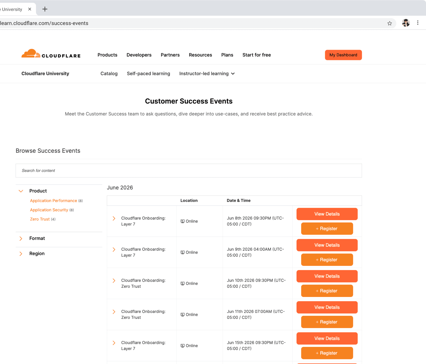
Color overload
Bright shades of orange buttons compete for attention, are hard to read, and visually overwhelming.
Close together touch targets with no reversal
The register button is too close to the view details button, and cannot be undone without an email to the Customer Education team.
Auditing the Existing CSS (expedited with AI)

I exported the entire CSS file and used Claude to parse and map it: every class name, every existing variable, every style override that had been applied since launch. What would have taken days of manual reading took hours.
Exploring Similar Sites
Both sites utilize Thought Industries as their LMS provider and provided valuable takeaways both in how customizable the platform is, and how to add benefit for our learners.
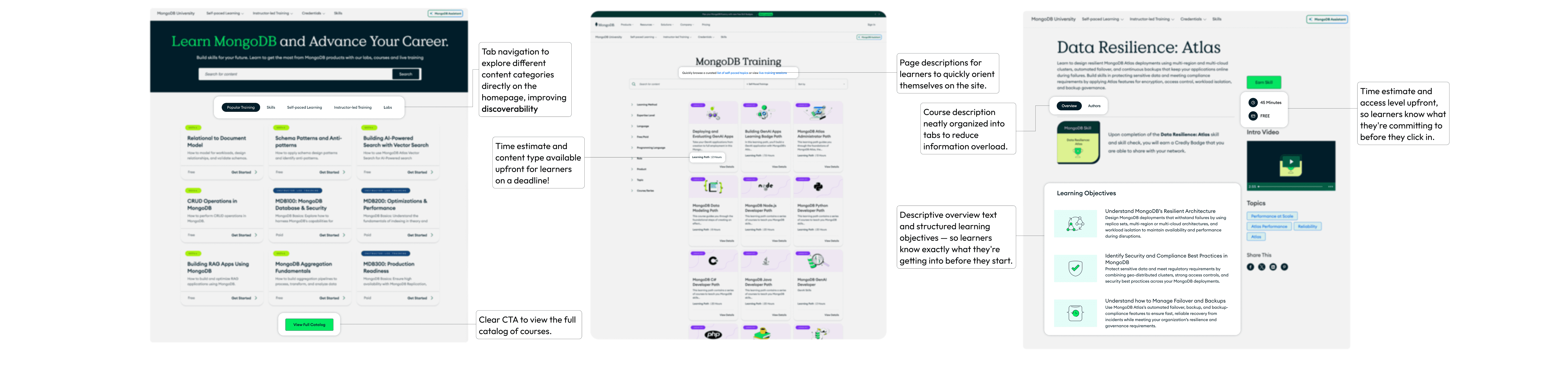

Main Takeaways
1
Give learners the information they need to self-select.
Duration, difficulty, access level, and a real course description upfront, before they commit to clicking in.
2
Make content easy to find.
Multiple CTAs to the catalog, tab navigation by content type, and global search across every page.
3
Make the platform feel like it belongs to the brand.
Consistent visual language throughout so the experience feels intentional, not a vendor default.
0.3 Design
Design Requirements
Before opening Figma, I wrote out what had to be true about every design choice.
Sustainable
No designer or engineer after me. I cannot over design or over engineer anything. It needs to be well documented and reasonable for a small team with no engineers to maintain and add to.
On-brand
Learners coming from cloudflare.com or dash.cloudflare.com shouldn't feel like they landed somewhere else.
Work with the Platform, Not Against
Pages are built with widgets inside a fixed document flow. CustomHTML is available but not feasible for a small team to maintain. Everything had to be achieved through CSS overrides working within the platform's existing containers and structure.
Shippable in 11 Weeks
The redesign of the core learner experience needed to be well scoped to be launched into production within 11 weeks. Perfect is the enemy of shipped.
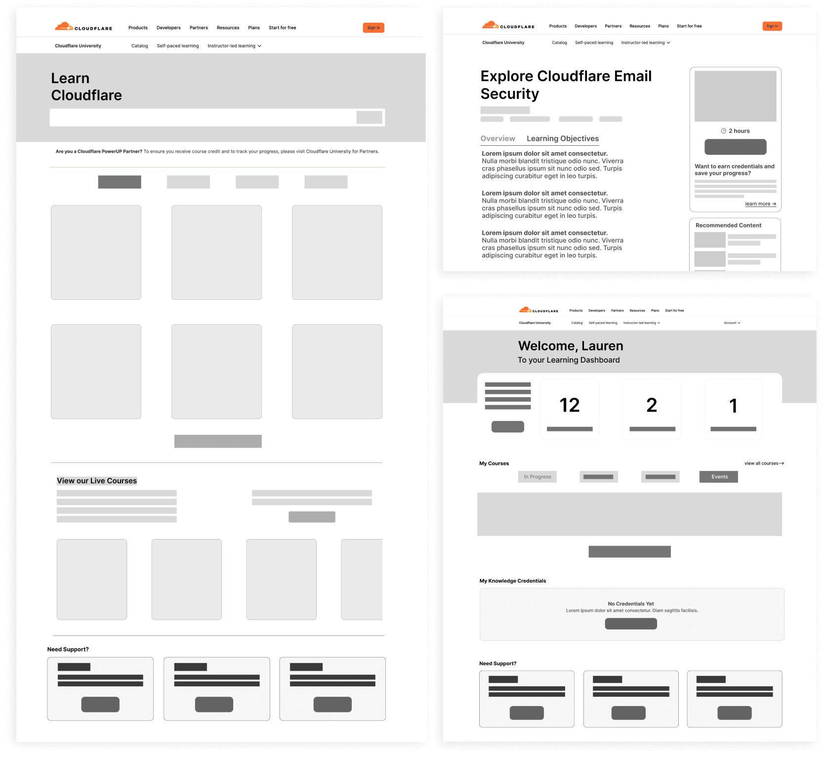
Early Iteration Process
Wireframes to mid-fi to working prototype leveraging AI to expedite my workflow.
1.
Markup existing designs and create wireframes in Figma.
2.
Iterate with AI to generate new ideas and get early feedback.
3.
Connect Figma MCP to ideate and develop MidFi versions.
4.
Claude (in OpenCode) builds an interactive prototype for team feedback.
5.
Team sign-off, turn designs into HiFi.

Design Language
Cloudflare maintains so many products and sites, many of which have their own distinct style outside of the brand colors. The team and I aligned on pulling design inspiration from the Cloudflare home page, and the developer docs.
It was important that this site maintained the look and feel of a Cloudflare site while still being its own experience.

0.4 Implementation
Quick Wins
Before any full page redesigns went live, I identified four changes that could ship immediately.
Course duration estimates
Added estimated durations to all 29 courses so learners could plan before committing to a course.
View Catalog CTA on homepage
A single button that didn't exist before. Immediate discoverability improvement with minimal implementation risk.
Catalog page refresh
Updated page title, more descriptive copy, and a back-to-home button. Made the catalog feel oriented rather than isolated.
"We're refreshing our look" banner
A site-wide banner setting expectations while the full redesign was in progress. Transparent, low friction, easy to remove.
Implementation Workflow
01.
Figma MCP pulls contexts.
02.
DevTools DOM extraction.
03.
Work with OpenCode to generate first CSS pass
04.
Test CSS in DevTools and make adjustments.
05.
Ship to production.


Homepage: designed first, implemented last.
Designed and implemented the homepage in a separate "Sandbox" account first, before touching the other pages.
Doing so showed me what is possible given the platform’s limitations, so I can go back to the drawing board if necessary.
Sets the visual language for the rest of the site and allows me to set up defined variables to pull from for consistency.
0.5 Results
Key Design Decisions
Home
The homepage needed to encourage finding new courses and needed to work for every user type, not just enterprise accounts.
Before :(

Out of the Box
No Cloudflare branding or visual language — looks like every other TI platform.
No Clear Path Forward
No primary CTA to guide learners deeper into the platform.
Prioritizes Enterprise Customers
The catalog widget surfaces content only enterprise users can access.
After :)

Course Details
Twenty-nine courses, almost nothing on their pages. Wrote and designed all 29 from scratch — structured copy, estimated durations, learning objectives, and recommended content sections.
Before :(

Confusing & Unintuitive
Logged in users cannot access the course directly from the course detail page.
Lack of Information
Difficult to gauge if a course is right for you.
After :)

“Dashboard” → “Learning Hub”
Rebuilt the global navigation, added site-wide search that indexes beyond just course titles, and renamed the learner dashboard to "Learning Hub" to avoid confusion with Cloudflare's main product dashboard.
Before :(

Elements compete for attention
Multiple shades of orange and confusing hierarchy make it hard to know where to look or what to do next.
Key elements buried on the page
Explore Catalog CTA is buried at the bottom of the page, along with a difficult to find email for users that need help.
After :)

High Impact Details
Course Duration Estimates
Estimated course durations using a formula then used AI to clean the existing completion time dataset from TI for honest estimates on every course page.
AI-scanned Course Packages
Had AI scan each course's content package to generate overview copy and recommended content suggestions. 29 courses, sourced directly from the actual course material.
Global Search & Better Indexing
TI only indexes title and short description natively. AI took the content packages to generate Keyword-rich meta descriptions to add every course. This meant a single search term could surface more courses based on similar content.
Outcome By the Numbers
60% Increase
Learners who rated their experience "Good" or "Excellent" before vs. after the redesign (52% → 83%).
50% Decrease
In negative ratings after the redesign (learners rating experience "Poor" or "Very Poor")
5X Increase
Course completion rate after the redesign went live.
0.6 Demo
0.7 Documentation
Built for Handoff
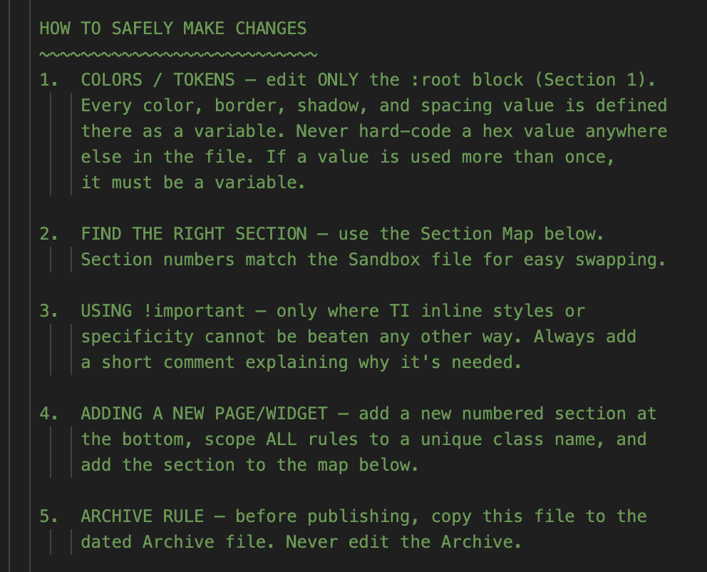
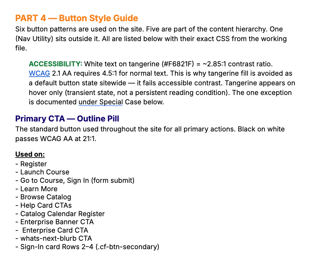
The CSS system was designed from the start for the person maintaining it after I left someone without any sort of front-end background.
Every color, type, and spacing decision lives in one:root block. 21 named sections with plain-language contribution guidelines built directly into the file.




0.8 Reflection
01
Design for your successor, not yourself.
No designer or engineer after me meant documentation was a design output, not an afterthought. The sustainability constraint made every decision cleaner.
02
AI as a force multiplier, not a replacement.
The agentic workflow let one intern cover four roles. Every decision still required judgment about what to ask for and when to push back on the output.
03
Shipping on a live site changes how you work.
No staging environment meant no safety net. It forced a carefulness and deliberateness that prototype-only projects don't.